Table of Contents
If you’re a Shopify seller, you probably know how important it is to have a cool and eye-catching online store. You spend hours designing your products, writing awesome descriptions, and setting up marketing campaigns.
But have you paid enough attention to your Shopify checkout?
Shopify checkout is the final step of your customer journey. It’s where you turn your visitors into buyers! It’s also where you can lose them if they encounter any hassle, confusion, or distraction.
That’s what we’re going to show you in this article. We’ll cover 20+ tips on how you can optimize your Shopify checkout to boost your conversion rate and increase your sales.
Let’s dive in without wasting more time!
What is Shopify Checkout Optimization?
Shopify checkout optimization is making your checkout hassle-free for your customers. It means making the checkout process as fast, easy, and secure as possible so customers can buy your products without a doubt.
Shopify checkout can make or break your sales. According to Shopify, a smooth and seamless checkout can increase conversions by up to 36%. That’s a huge opportunity!
Shopify checkout optimization is about more than just speed, though. It’s also about making your customers happy, loyal, and satisfied. It’s about making your customers feel like they’re getting you a great deal and service.
You might think to yourself: “How can I optimize my Shopify checkout to achieve these goals?”. In the next section, we’ll share the best tips you can use to rock your online store today!
22+ Tried & True Shopify Checkout Optimization Tips
1. Customize Your Shopify Checkout to Match Your Brand and Style
You want your Shopify checkout to look consistent with the rest of your online store so that your customers feel familiar and comfortable.
You can customize your checkout in many ways, such as:
- Adding your logo and favicon;
- Choosing your colors and fonts;
- Adding a background image or color;
- Adding custom content, such as a banner or a message;
- Adding trust badges or security seals;
2. Make Your CTA Button Stand Out and Grab Attention
Your CTA button is in the final step of your checkout process, so you want to ensure it’s visible. A good way to do that is to pick a color that pops. You also want to use words that urge action, like “Buy now”, “Complete order”, or “Pay securely”.
And don’t forget to add some urgency or scarcity, like “Only 2 left” or “Order in the next 10 minutes and get free shipping”. A fun icon or emoji, like a shopping cart, a checkmark, or a smiley face, can also make your CTA button more appealing.
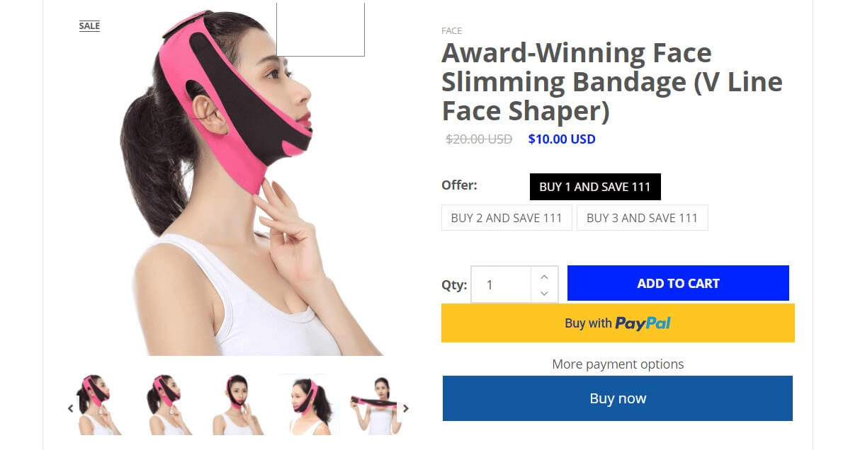
Optimize CTA buttons and make them stand out
3. Offer Guest Checkout Option to Save Time and Hassle
Nothing kills the mood like having to create an account or sign in before you can buy something. Some customers just want to get it over with and move on. They don’t want to give you their life story or remember another password.
That’s why you should consider letting your customers check out as guests. This means no strings attached. Just a quick and easy transaction. You’ll make them happy and boost your sales.
You can do this in the Shopify admin under Settings > Checkout > Customer contact method. Ensure you unticked “Require the customer to log in to their account before checkout”.
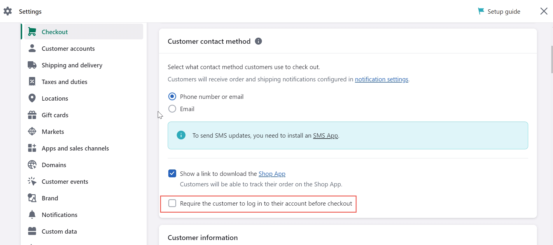
Untick request customer account login to speed up the checkout process
| 💡 This tip is optional, however, depending on whether allowing a faster checkout process or building customer loyalty is a top priority for you. |
4. Use FOMO to Create Urgency and Scarcity
FOMO means fear of missing out and is when you feel like you have to act fast or you’ll lose something good or valuable.
It’s a sneaky way to improve your Shopify checkout, and you can use FOMO to make your customers feel like they must buy now or regret it later.
Some ways to use FOMO are:
- Showing how many people are viewing or buying the same product;
- Showing how many products are left in stock. You can use Shopify stock alert apps for this purpose;
- Showing how much time is left for a special offer or deal. You can use a countdown timer for this;
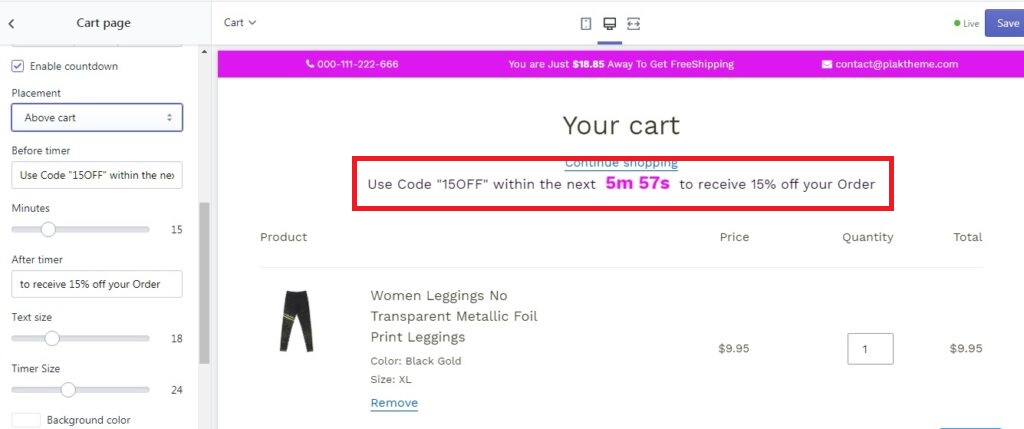
Take advantage of FOMO techniques and urge the desire to buy
5. Ask for Card Information in a Secure and Trustworthy Way
One of the most awkward checkout processes is asking customers for their card information. Some customers may freak out or wonder if you’re a scammer.
Therefore, you need to ask for card information in a way that makes your customers feel relaxed and happy with you.
One possible practice is using reliable payment gateways like Shopify Payments, Stripe, or Apple Pay. These gateways are safe and popular with lots of customers.
Alongside that, you can also show them some badges or seals that show you’re trustworthy, like an SSL certificate, PCI compliance, or Verified by Visa. These badges show that you’re not a shady character and respect your customers’ security and privacy.
6. Leave The Shopping Cart Open
Some Shopify stores hide the shopping cart when customers visit the checkout page. This means the customer can’t see what they’re buying anymore and may get confused or have second thoughts. That’s why you should keep the shopping cart open so your customers can always see what they’re buying.
This way, customers can keep track of their purchases and lower the chances of them ditching their cart. You can keep the shopping cart open in the Shopify admin under Online Store > Themes > Customize > Cart page > Theme settings.
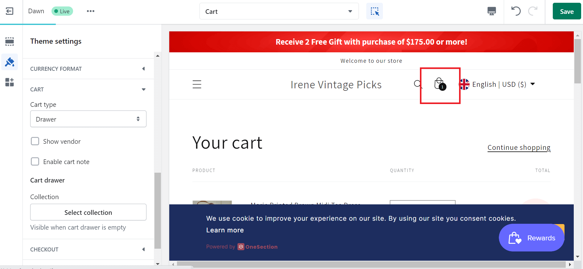
Display the shopping cart section on your Shopify store
You can choose from three options:
- Page: The cart page opens on a new page when the customer clicks on the cart icon;
- Drawer: The cart page opens on a sliding drawer on the same page when the customer clicks on the cart icon. This is the best option for most Shopify stores because it keeps the customer on the same page and shows them their cart items without interrupting their flow;
- Popup Notification: The cart only shows as a popup. This option is good but less great than Drawer.
7. Build Trust with Customers
Trust is one of the most important factors that influence online shopping behavior. If your customers don’t trust you, they won’t buy from you. That’s why you should build trust with your customers throughout your online store, especially on your Shopify checkout page.
You can make your customers trust you in many ways, like:
- Show them what others think, like reviews, ratings, testimonials, or photos;
- Display some trust badges that prove you’re legit, such as an SSL certificate, PCI compliance, or Verified by Visa;
- Offer some promises or guarantees, like a money-back guarantee, free returns, or lifetime warranty;
- Guide them on how to reach you by adding a phone number, email address, physical address, or live chat support.
8. Use Exit-Intent Popups to Secure Sales
Exit-intent popups appear when a customer is about to leave your online store without buying a thing. They are made to catch the customer’s eye and make them change their mind.
It’s no denying that this is one of the best ways to improve your Shopify checkout and keep customers from leaving.
You can use exit-intent popups in many ways, like:
- Tempt them with a discount code or a gift;
- Ask them why they’re leaving, and convince them to continue browsing;
- Show them what’s currently the center of attention that they would fancy;
- Remind them of what they’re missing out on or what they’re scoring.
9. Show Your Checkout Progress to Keep Your Customers On Track
Another thing that annoys your customers is not knowing how long the checkout process will take. They may get restless, bored, or nervous and bail before they buy anything.
That’s why you should show your checkout progress to keep your customers on track. You can use a progress bar or indicator to show your customers how far they’ve come and have to go.
You cannot customize the Shopify checkout page if you use themes. So remember to choose those with the checkout process on one page, and the progress bar shows the parts of the page. This can cut the loading time and make the checkout process quicker and easier for your customer.
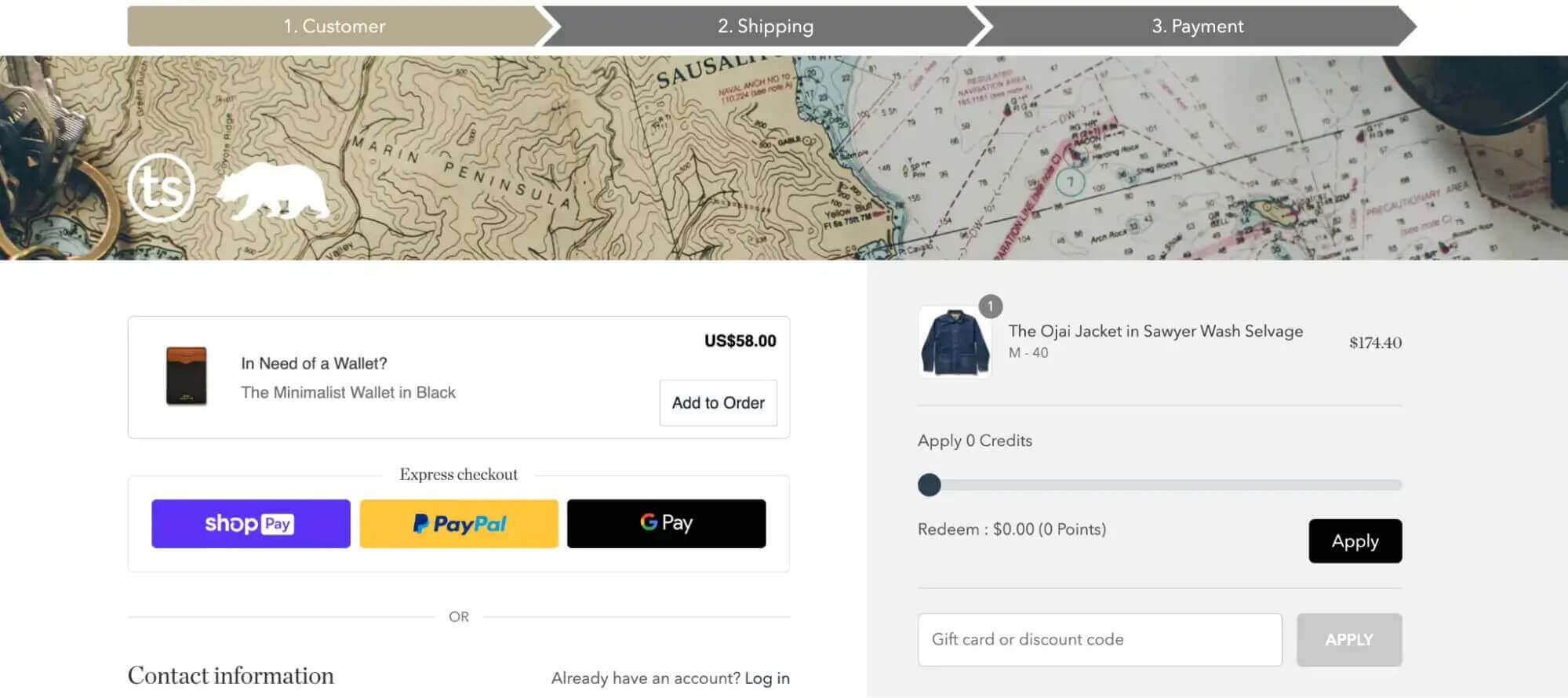
The checkout process and progress bar can help keep the customers on track
10. Optimize Your Site for Mobile Devices
More and more people are shopping online using their mobile devices, such as smartphones or tablets. Shopify said mobile devices accounted for 58.99% of global eCommerce traffic in Q2.2022. That means that if your online store is not optimized for mobile devices, you miss out on a huge opportunity to increase your sales.
It is best to optimize your site for mobile devices, as well as ensure your online store looks good and works well on any device and screen size. As a result, your customers can have a smooth and seamless shopping experience, whether using a desktop, a laptop, or a mobile device.
So what to do?
- Ensure your Shopify checkout page works well with many touch gestures on mobile devices;
- Have a design that changes to fit different screen sizes automatically;
- Use large, easy-to-tap buttons for actions.
11. Cross-sell and Upsell to Increase Your Average Order Value
Cross-selling and upselling are ways to make your customers spend more money and increase your average order value.
Cross-selling is when you offer your customers more products that go well with their buying.
Upselling is when you offer your customers a better or fancier version of what they’re buying.
For example, if your customer is buying a laptop, you can cross-sell them a laptop bag or a mouse to go with it. If your customer buys a basic plan, you can upsell them to a premium one with more bells and whistles.
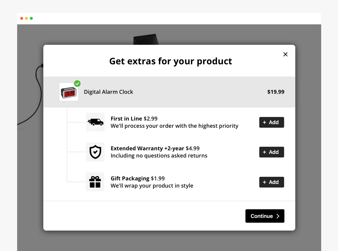
Boost your store’s AOV via cross-selling and upselling
With these strategies, you’ll improve your Shopify checkout page for you and your customers. And there’ll be a higher chance that your customers find a product they didn’t know they wanted.
| 💡 If you want to learn more about tips to increase average order value, check out the article: 07 Best Upselling Tips To Boost Your Average Order Value By 30%! |
12. Offer Free Shipping or Gifts to Entice Your Customers
High shipping costs can scare your customers away. They can make your products look pricey and turn off your customers. Some customers may ditch their carts if they have to pay extra for shipping.
That’s why you should give them free shipping or gifts. They can make your customers feel like they are getting a good deal and good service from you. They can also boost your sales and customer loyalty.
13. Optimize Your Site Speed and Loading Time
Guess what is one of the biggest problems that affect Shopify checkout?
Site speed.
This regards how fast your store shows up on different gadgets and browsers. A study by Friction Studio says that if your site takes one second longer to load, you can lose 7% of your sales. Ouch! On the contrary, if your site is fast and smooth, you can boost your sales by 35%!
It’s clear that site speed can make or break your customer satisfaction, as well as affect your sales and SEO ranking. One of the easiest ways to boost your site speed is by using third-party Shopify apps.
Speaking of that, you should check out Swift, an all-rounder SEO and Page Speed Optimizing app for Shopify. With its core integrated with ChatGPT, Swift offers rich page speed optimization features such as lazy loading, preload, mini files, image compression,… that could resolve your side speed concerns in a matter of seconds.
Improve site speed significantly with SwiftApart from that, you can enhance your site’s load speed manually. Here are some tips:
- Pick a fast theme;
- Shrink and resize your pictures;
- Get rid of any apps or code you don’t need;
- Use a CDN to deliver your content faster;
- Make your CSS, JavaScript, and HTML files smaller.
14. Take Advantage of Auto-completion of Customer Information
It’s a pain having to type in personal info in long and boring forms. This can take forever, and lots of customers may wonder if they can trust you with their info.
That’s why you should use auto-completion of customer info.
Auto-completion can suggest your full information in certain fields based on what you’ve submitted before.
Auto-completion can save your customers’ time from repeatedly typing their addresses or phone numbers.
This is super handy for customers who have bought from you before—you don’t want to make them repeat their information every time!
But wait, there’s more. Auto-completion also helps avoid errors, which means fewer returns! With auto-completion, customers won’t have to stress about messing up their order details because the system will do it for them.
15. Provide Multiple Contact Methods So That Customers Can Reach You Easily
It’s crucial that you give your customers different ways to contact you after they buy something. For example, on the Shopify checkout page, customers can pick “email” or “phone number or email.”
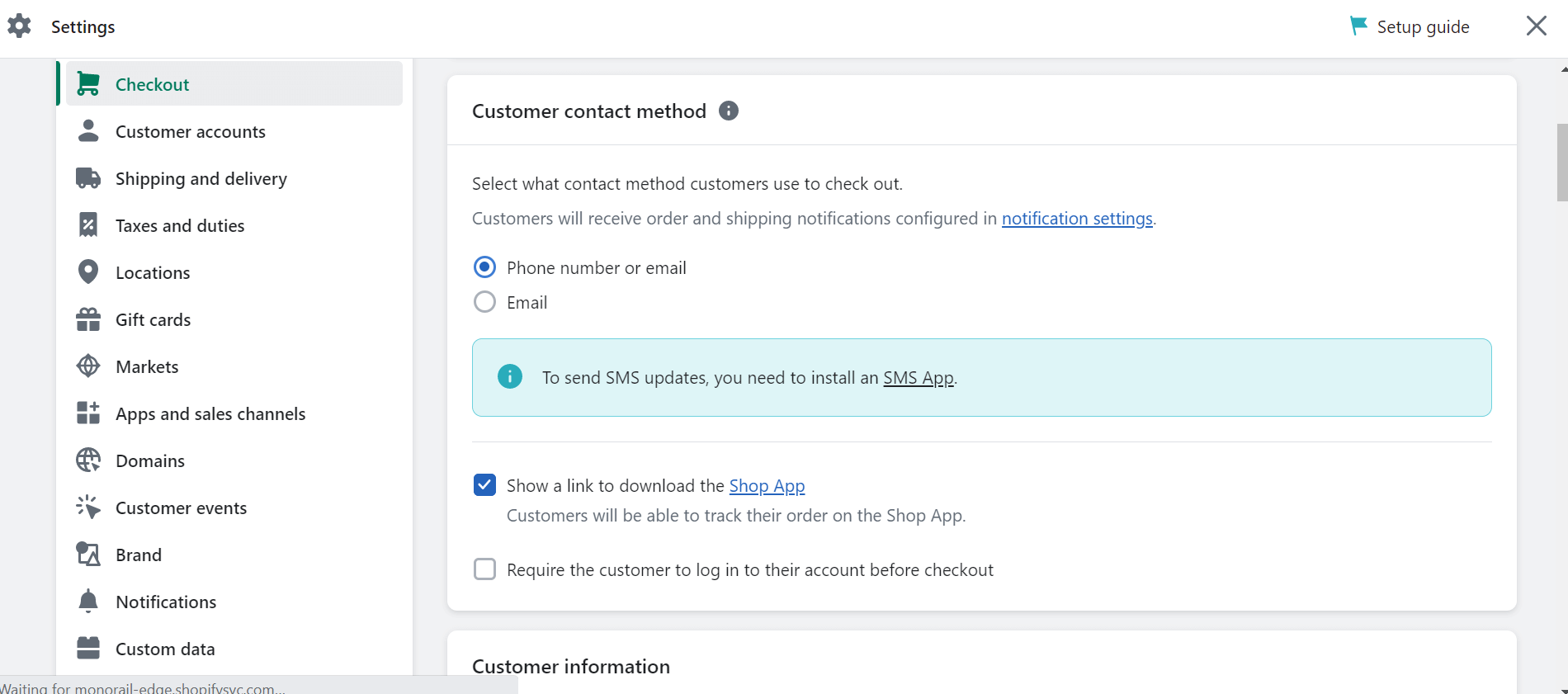
Enable multiple contact methods for your consumers to conveniently reach you
Some people don’t check their email often. But with the “phone number or email” option, they don’t have to. If they want to get a text from you about how their order is doing, they can go for this option.
This way, you will make your customers happy because they know they won’t miss any news about their purchases!
16. Present Refund and Return Information So Customers Know What to Expect
Your customers can stop buying if they do not know what will happen if they don’t like what they get. They may be scared of losing their money or having a hard time sending back their products.
In this case, you need to have a clear and fair refund and return policy and tell your customers about it before they buy. You can show them your refund and return info in different ways on the Shopify checkout page, like:
- Putting a link to your refund and return policy on your product pages and your checkout page;
- Make your customers check a box or see a message that says they agree to your refund & return policy before they buy;
- A banner shows off your refund, return policy, or any cool offers, like free returns or a longer warranty.
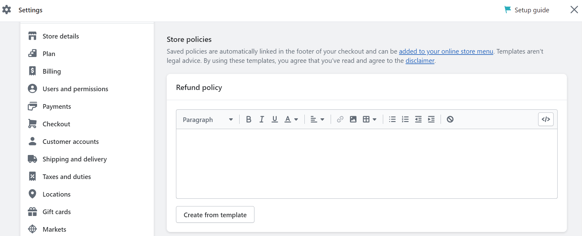
Return & Refund policy can prove your store’s reliability and fairness
💡Shopify offers two ways to support merchants in writing their Refund or Return policy:
|
17. Give Multiple Payment and Shipping Options to Suit Your Customers’ Preferences
One of the best ways to optimize your Shopify checkout is to show different payment options on your checkout page.
It lets your customers pick how they want to pay, which can sometimes be more accessible than the default option. You want to ensure you cater to your customer’s preferences and needs and offer them convenience and flexibility.
That’s why you should accept different payment methods on your Shopify checkout, like:
- Credit or debit cards;
- Shopping apps like Shop Pay and PayPal;
- Digital wallets like Samsung Pay, Apple Pay, and Google Pay;
- Let them buy now and pay later in installments.
You can add payment methods from the Shopify admin under the Payments section.
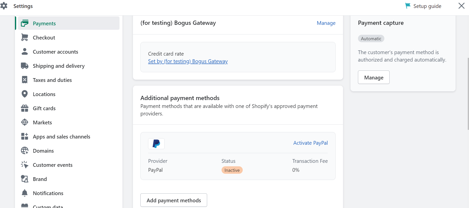
Add several payment methods to optimize your Shopify checkout
18. Enable 1-click Checkout to Make Your Checkout Process Faster and Easier
1-click checkout is a must-have for Shopify checkout optimization.
It makes your customers’ lives easier by letting them buy their stuff and get out with just one click. No more going through a bunch of different steps to place their order. That’s the worst!
With 1-click checkout, customers can avoid wasting time on your site, getting distracted by something else online, or abandoning their cart. They only have to enter their name, email address, and shipping address once, and they’re good to go.
The next time they shop, they can finish the online checkout process with a single click. How fast and easy is that!
19. Provide Carbon Neutral Shipping to Show Social Responsibility
It’s time to go green by providing carbon-neutral shipping options on your Shopify checkout page. Shipping with a carbon-neutral carrier is the way to go. It shrinks your carbon footprint like magic. Less waste, less trash, less gasses.
This way, you can show your social responsibility and commitment to environmental sustainability and appeal to eco-conscious customers. Customers will love your brand for caring about the planet and their own commitment efforts!
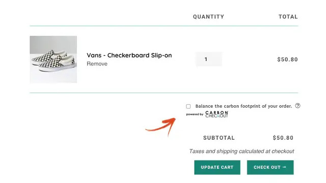
Show your commitment to the environment by providing carbon-neutral shipping options
20. Don’t Hide The Support from Customers
One of the things that can make your customers smile is not hiding the support from them. You want to ensure that your customers can get help when they feel like they need it, whether they have a question, a problem, or feedback.
You can provide support to your customers in different ways on the Shopify checkout page, such as:
- Include a contact information section so customers can connect with you via email, phone, or chat;
- Attach a live chat widget or a chatbot that offers instant support on your online store;
- Add a FAQ section or a help page that clears up common questions or worries about your products or services
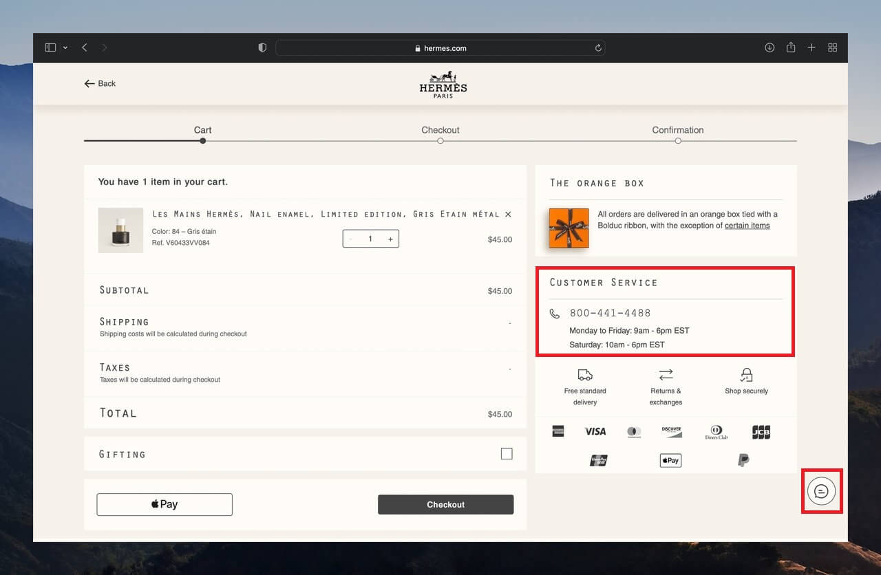
Support your customers when they are in need with visible help options
21. Use Testimonials to Show Social Proof and Credibility
Customer testimonials are one hack that can help with Shopify checkout optimization. A customer testimonial is pretty much a review or a recommendation from a customer for your product or service.
They’re usually quick and easy, but they do wonders in getting people to move. They’re a great way to show off the awesome stuff your products or services can do—and they can make people feel like you’re the real deal.
One of the best ways to score testimonials for business is to use Shopify review apps. If you’re clueless about which apps to use, you can give Ali Reviews a try! As one of the most popular product review apps on the Shopify App Store, it’s received thousands of positive comments on its effectiveness and adequacy.
With Ali Reviews, it becomes effortless to import, showcase, and display impactful product reviews on your Shopify store and drive strong social proof. The app comes with stunning review widget, fully customizable to your store branding is your key to boosting sales on any pages of your site.
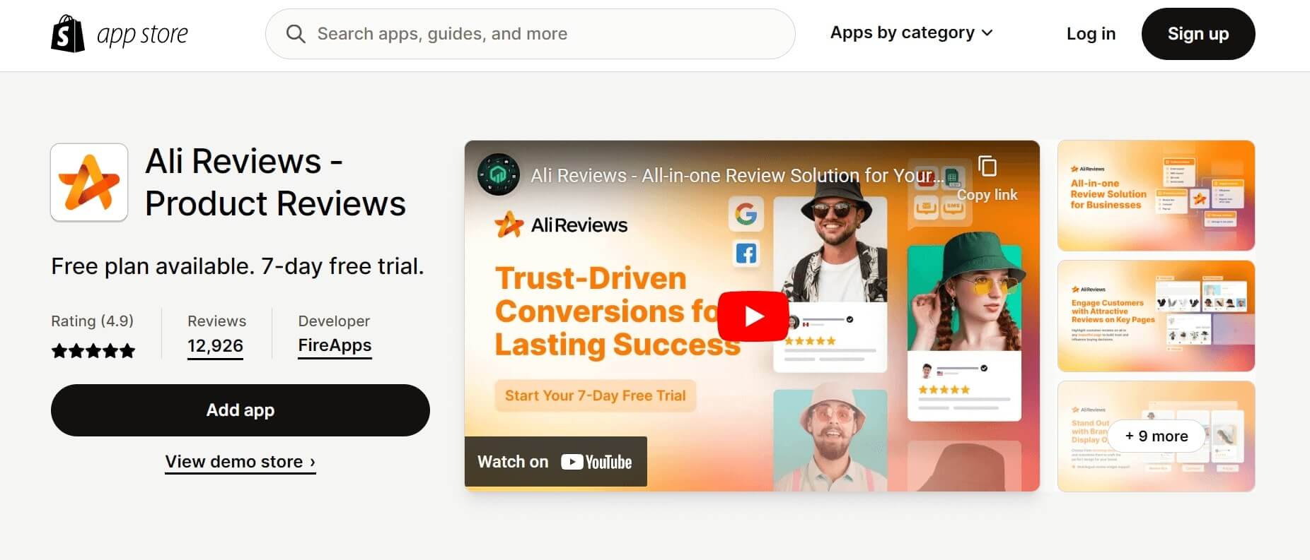
Make use of product review apps to provide social proof and legitimacy
| 💡 Before moving on to the next tips, check out our articles on creating great Shopify review pages: |
22. Activate Abandonment Checkout Emails to Recover Lost Sales
You noticed from the numbers that some customers did not finish their purchases. Did you know you can automatically email customers from your Shopify store to these customers?
Yes, it’s possible with Shopify! You can set it up in your Shopify admin under the Abandoned Checkout Emails. You can also tweak the email subject line and the message.
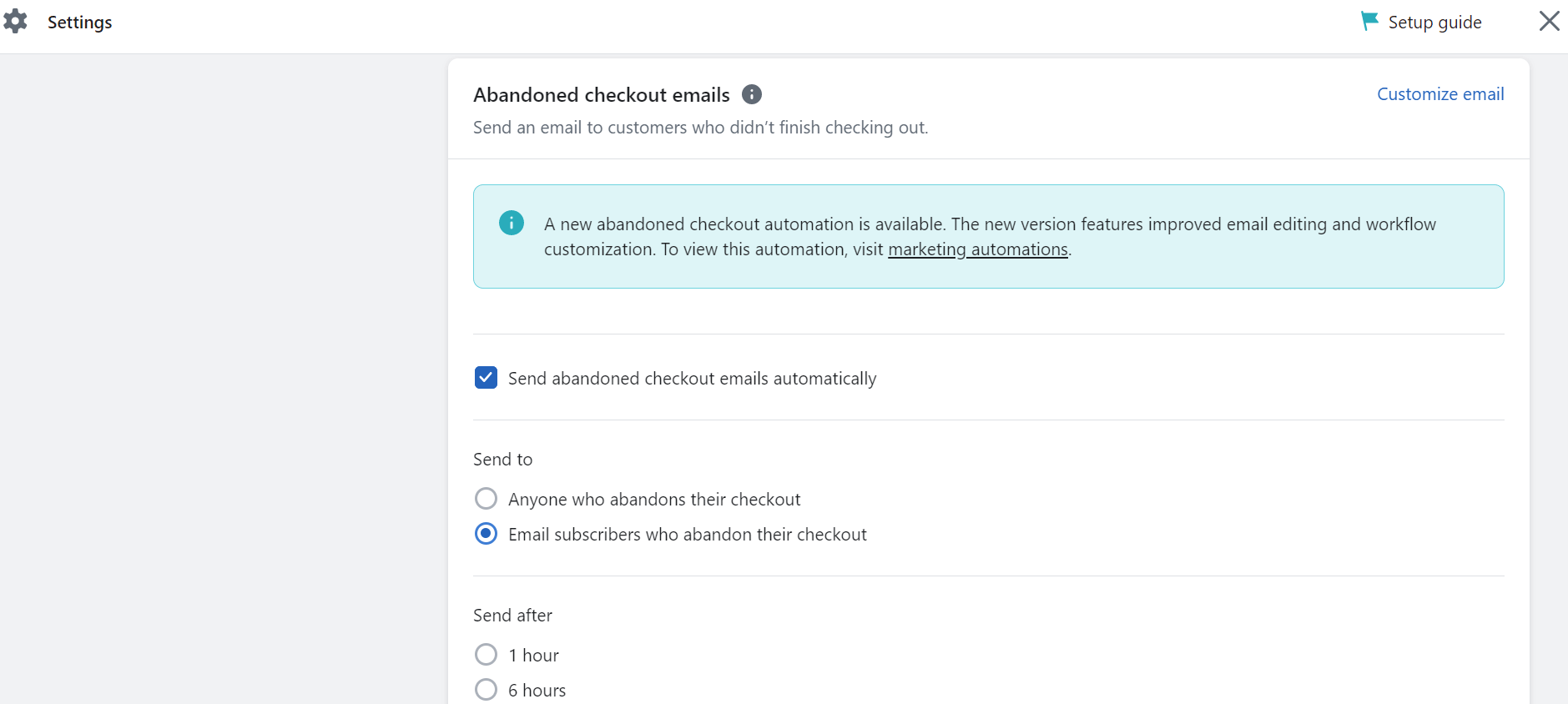
Automatically remind your customers of their purchases with Abandoned Checkout Emails feature
| 💡 A small note:
According to an article by Rejoiner, the ideal time to send abandoned cart emails is 60 minutes after the customer’s last visit to your store. Sending too soon or too late is a no-no for your conversion rates. |
23. Delight Customers With a Memorable Thank-You Page
One of the things that can make your customers happy and loyal is wowing them with a memorable thank-you page.
The thank-you page is the page that pops up after your customer buys something. It’s a chance for you to show gratitude and offer more value to your customer.
You can do it in different ways, like showing:
- A personalized video or a GIF that thanks them and cheers their buy;
- A referral program or a loyalty program that treats them for sharing or returning;
- A survey or a feedback form that asks them for their feedback or tips;
- A social media share button or a hashtag encourages them to tell the world or join the community.
Conclusion
You’ve just learned 23 tips to optimize your Shopify checkout and increase sales. The checkout process is the most crucial part of your online store, as it can make or break your conversions. Optimizing your checkout process can help reduce friction, increase trust, and improve customer satisfaction.
So, what are you waiting for? Try these tips and see how they can boost your online store.
Trust us, your customers will love it!
